Module 4: Design Principles for Effective and Accessible Multimedia
What did you find when you ran the WAVE accessibility report on your blog post?
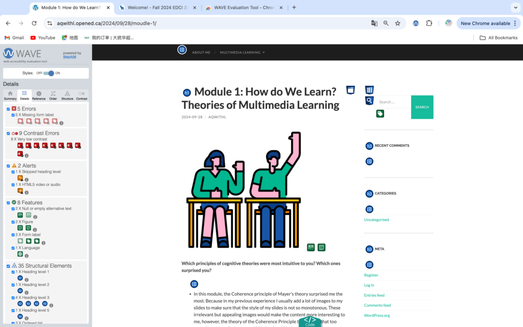
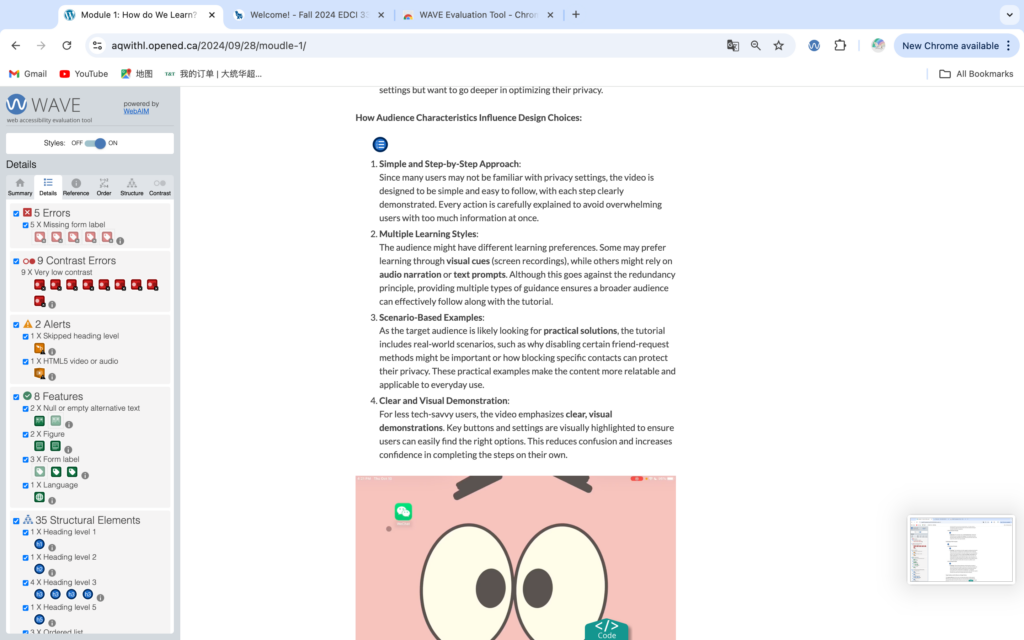
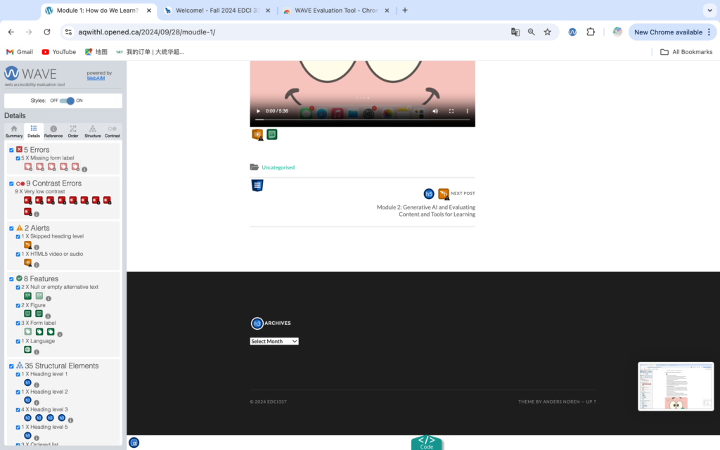
After downloading the WAZE plugin in my browser and applying it to my moudle 1 blog, I realized that my blog was missing significant contrast in many areas, which resulted in readers not being able to quickly get information when viewing my site. For example, I didn’t take a different type of font size or bold in areas that I thought were more important. This causes the reader to see the same enlarged font for both body text and keywords, which can be misleading and prevent them from doing a quick read. I also did not add any titles or notes above my video, which can confuse readers as to what the video is about and why it exists.
Also, through the WAZE report I found out that I didn’t optimize for people with visual impairments. I need to make sure that my font colors and sizes are easy for them to read and differentiate between, for example, if I don’t distinguish between the title and the body of the video, they won’t be able to tell what part they are reading. At the same time, I needed to avoid typographical errors that would make it impossible for visually impaired people to find the layout. Finally, I needed to include headings for each section to help guide the reader where to read.
Text-to-speech tools
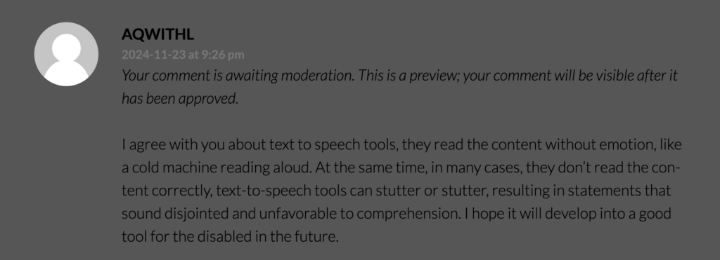
I often use text-to-speech on social media programs where I ask Siri to read out the message for me. For example, when I’m driving and don’t have access to my phone, or don’t have my hands free to control my phone. In addition, when I don’t want to look at the phone screen but want to read a book, I will use text-to-speech to read the book and let the AI read the article. When I use text-to-speech tools, I have the same idea as Mayer’s Voice Principle, although with other programs like Siri they try to simulate the human voice and add emotion to the reading. I’m still not able to concentrate as much as I would if I were listening to a real person, because I can clearly feel that there’s a machine voice in there that isn’t really emotional, which makes it impossible for me to immerse myself in it. For example, the voice of Siri makes me feel more cold-blooded, a machine reporting back to me on what I’m doing.
What does inclusive design mean to you?
Inclusive design is a very important presence for me. inclusive design is not just for the visually impaired, it is for all people. It includes religion, language, race, culture. For example, I am not a native English speaker or a Canadian. When social media platforms send me abbreviated slang or complex phrases, I don’t understand them, and even though I’ve studied and speak English, I don’t understand all of them. With Inclusive Design, trying to use simple words and phrases can significantly in helping people with poor reading skills to quickly understand the meaning without getting lost.
What design principles are used in posters designed with Canva?
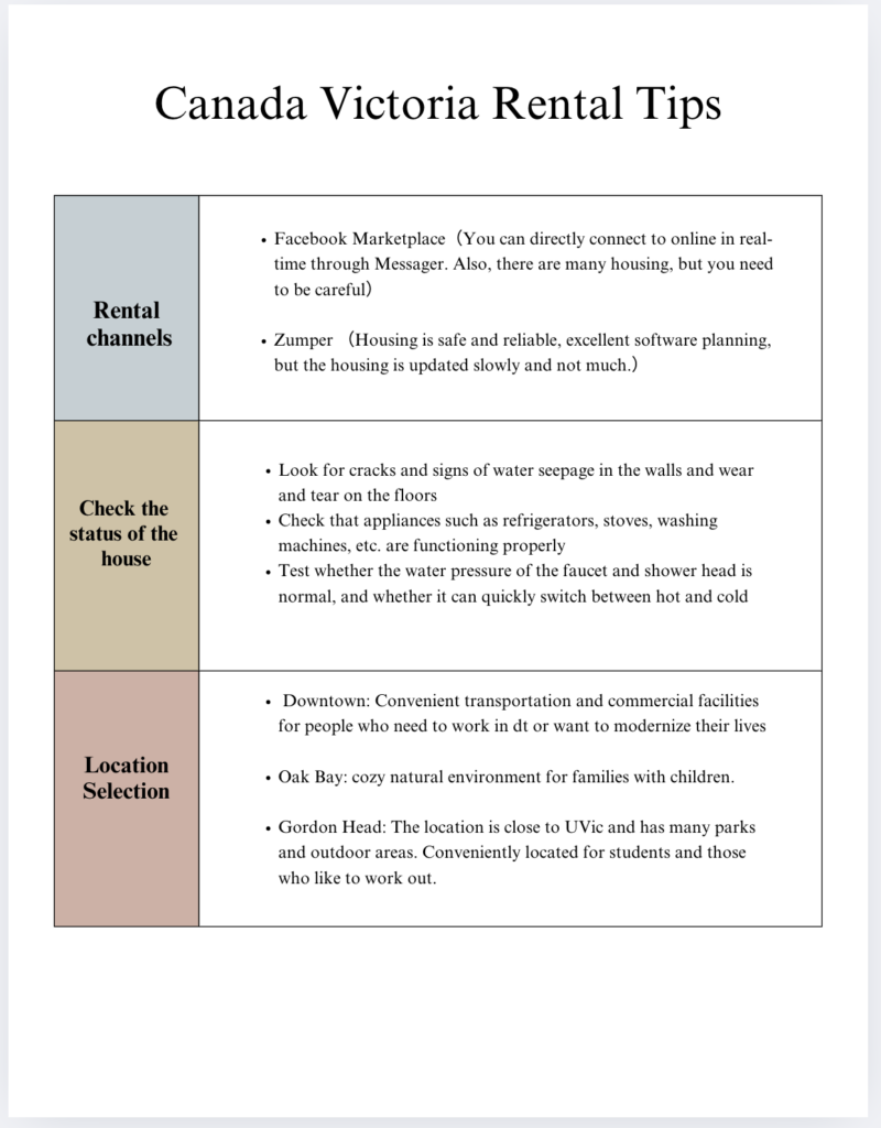
I used the Coherence Principle in my poster, where I didn’t use useless pictures or other decorative elements. Instead, I simply drew a table to categorize the content so that readers can easily understand and read it. At the same time, I made sure that all the font colors are uniformly black, and white background. This makes it easy to read for both general and visually impaired readers. I also made sure that the fonts were formatted consistently in Times New Roman, and I used the Signalling Principle to add bold fonts and colors to the subheadings in the table so that readers could quickly find the parts they wanted to read, and I also made the lines and symbols for each of the knowledge points so that they were clearer to read.
Comments
Comments are Disabled